
How to Find the Precise Entry Point Using Multi-Time Frame Analysis? | With a Practical Example
It has surely happened to you: you see a great buy signal on one time frame, excitedly enter the trade, but suddenly the market reverses against your prediction, and you incur a loss! This is precisely the common mistake many traders, especially beginners, make. Why? Because they only look at one time frame and fail to see the “bigger picture.”
This is where multi-time frame analysis comes to your aid. In this article, we will teach you step-by-step and in a completely practical manner how to significantly refine your entry points using this technique, lower your trading risk, and avoid falling into the trap of false signals. Stay with Nima Imani’s website for more.
Table of Content
- Multi-Time Frame Analysis in Simple Terms
- Determining the Trend on a Higher Time Frame
- Finding the Market Structure
- Entering on a Lower Time Frame
- Practical Example on a Currency Pair
- Applicable Example on Crypto
- Conclusion
Multi-Time Frame Analysis in Simple Terms
Multi-time frame analysis, in simple terms, means examining an asset across different time intervals before making a final trading decision. If you focus solely on one time frame, it’s like looking at a single leaf with a magnifying glass without understanding the state of the entire forest. Conversely, if you only look at larger time frames, you might miss the precise path of movement and suitable entry points.
The ultimate goal of this method is to combine the strengths of these two perspectives: using higher time frames to identify the main trend and key levels, and using lower time frames to find the best entry point and manage risk. In this way, you not only know the direction of the ship’s movement but also find the exact best moment to board it.
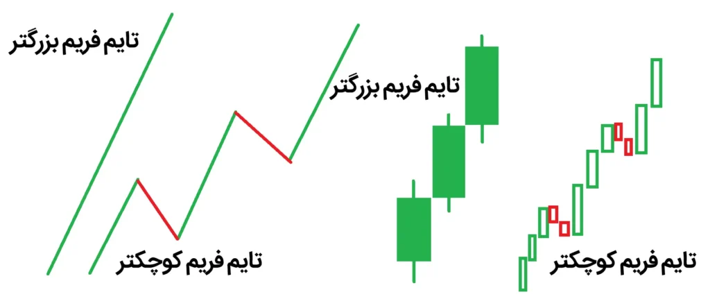
The golden rule in this analysis style is to follow a Top-Down approach. This means we always start our analysis from the largest time frame and move towards smaller time frames.
Determining the Trend on a Higher Time Frame
The first and most crucial step in multi-time frame analysis is to identify the “bigger picture” of the market. Imagine you are planning a long journey. First, you need to choose your destination and see the overall route on a map; then, it’s time for the details, like side streets. In trading, it’s exactly the same. The higher time frame is your roadmap.
Why is the Higher Time Frame So Important?
Higher time frames (like daily or weekly) show the real, unadulterated market picture. The price noise and emotional fluctuations seen in lower time frames are filtered out in these intervals, leaving only the main price movement. For this reason, the trend identified on a higher time frame carries significantly more validity.
How to Choose the Appropriate Higher Time Frame?
The choice of the higher time frame depends on your trading style. A simple rule of thumb is: the higher time frame should be at least 4 times your trading time frame. For example:
- If you are a scalper and work with 1-minute or 5-minute time frames, a suitable higher time frame for you would be 15 minutes or 1 hour.
- If you are a day trader and trade using 15-minute or 1-hour time frames, choose the 4-hour or daily time frame as your higher time frame.
- If you are a swing trader and your trades last from several days to several weeks, the daily and weekly time frames are suitable options.
Three Tasks to Perform on the Higher Time Frame
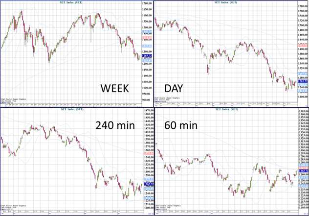
After determining the higher time frame suitable for your trading style, there are three essential tasks you need to accomplish:
- Identifying the Overall Trend
Identifying the trend on a higher time frame is not difficult. Several simple and practical methods exist for this purpose:
- Method 1: Simple Trend Line
Connect two significant lows or two significant highs. If the trend line is bullish (higher lows), the market is in an uptrend. If the trend line is bearish (lower highs), the market is in a downtrend. If the trend line is horizontal, the market is in a neutral or ranging zone.
- Method 2: Moving Average
Use a Simple Moving Average with a period of 200 (MA200). If the price is above this average and the average is sloping upwards, the trend is bullish. If the price is below the average and the average is sloping downwards, the trend is bearish.
- Method 3: Higher Highs and Higher Lows (HH/HL) / Lower Highs and Lower Lows (LH/LL)
The simplest method: In an uptrend, we observe Higher Highs and Higher Lows. In a downtrend, we see Lower Highs and Lower Lows.
Most Important Rule: Once you’ve identified the trend, remember a golden rule: “The trend is your friend.” Always try to trade in the direction of the main trend. If the trend is bullish, look for buying opportunities; if it’s bearish, look for selling opportunities. Trading against the main trend is like running against traffic on a highway; it might work a few times, but the risk is extremely high.
- Identifying Key Levels
After determining the trend, it’s time to find the important zones. These are areas where the price has reacted in the past and is likely to react again.
What Levels Should You Identify?
- Major Supports and Resistances: Places where the price has hit multiple times and reversed. The more touches, the more valid the level.
- Previous Highs and Lows: The last significant price swings. The price usually reacts when it reaches these areas.
- Psychological Levels (Round Numbers): For example, on the EUR/USD pair, levels like 1.1000 or 1.2000. In Bitcoin, numbers like 30,000or30,000 or 50,000. These levels gain psychological importance due to the concentration of traders’ attention on them.
- Fibonacci Levels: If you work with Fibonacci, the 0.382, 0.5, and 0.618 levels on the higher time frame can be very significant.
Pro Tip: Mark these levels on your higher time frame chart. Then, when you switch to a lower time frame, keep those same lines visible. The strength of these levels on the higher time frame is such that they continue to act as key zones even on the lower time frame.
- Defining the Overall Strategy
Now that you know the trend and key levels, it’s time to define your trading strategy. This strategy should be adjusted based on three market conditions:
-
A) Bullish Market (Uptrend):
-
Only look for buy (Long) opportunities.
-
Wait for the price to reach support levels or retracement areas.
-
Use the price’s reaction to supports to enter trades.
-
Selling in this market is high-risk, unless you are an expert trader with strong reasons for a trend reversal.
-
B) Bearish Market (Downtrend):
-
Only look for sell (Short) opportunities.
-
Wait for the price to reach resistance levels or retracement areas.
-
Use the price’s reaction to resistances to enter trades.
-
Buying in this market is as risky as selling in a bullish market.
-
C) Neutral or Ranging Market (Horizontal Trend):
-
You can both buy and sell, but with a specific strategy.
-
Main Strategy: Buy near support and sell near resistance.
-
Place your stop-loss slightly below the support (for buys) and slightly above the resistance (for sells).
-
In a ranging market, avoid trading in the middle of the range, as you have neither a reliable support nor resistance there.
A Simple Example: Suppose on the daily time frame, the trend is bullish, and the price is near a strong support level (e.g., the 200-day moving average). Your strategy is clear: look for a buying opportunity. Now, you move to a lower time frame to find the best entry point. This means you have aligned yourself with the trend, increasing the probability of your trade’s success.
Common Mistakes at This Stage
It’s crucial to avoid common pitfalls when performing higher time frame analysis. Here are a few to watch out for:
- Looking at the Higher Time Frame Only for Confirmation: Some traders first get a signal on a lower time frame and then check the higher time frame. This approach is fundamentally flawed. You must always analyze from top to bottom (higher to lower time frames).
- Using an Excessively Large Time Frame: If you’re a day trader, choosing a monthly time frame as your higher time frame will cause you to miss many critical details. Your higher time frame should be appropriate for your trading style.
- Changing Your Mind Based on a Single Counter-Candle: On a higher time frame, a single opposing candle does not signify a trend reversal. To identify a trend change, you need to see at least a few candles forming a recognizable structure.
Summary and Final Note
The higher time frame is the bedrock of your analysis. Invest sufficient time in this stage and do not rush. Ensure you have correctly identified the primary trend and accurately marked the key levels on your chart. Remember, the more precise your analysis at this stage, the easier and more confidently you will proceed with the subsequent steps (finding market structure and entering on a lower time frame).
This is the first and most crucial step of the “three golden steps” of multi-time frame analysis. In the next step, you will learn how to find the market structure on the intermediate time frame and prepare yourself for entry.
Finding Market Structure
After you have established the big picture of the market on the higher time frame, it’s time for a critical step: finding the market structure on the intermediate time frame. If we consider the higher time frame as the overall trading “strategy,” the intermediate time frame represents our “battle tactics.” This is where we decide precisely which area and with what plan we will enter a trade.
Why is the Intermediate Time Frame So Important?
The intermediate time frame acts as a crucial bridge. On one hand, it takes the overall direction from the higher time frame, and on the other, it provides enough detail to find entry zones. Without this bridge, we either get caught up in the noise of lower time frames or remain so general that we fail to find a suitable entry point.
If your higher time frame is daily, your intermediate time frame will typically be 4-hour or 1-hour. If you use the 4-hour time frame as your higher one, the intermediate time frame could be 1-hour or 30-minute.
Now, let’s move on to the three main missions you need to accomplish on this intermediate time frame:
- Verifying Alignment
The first task on the intermediate time frame is to check its alignment with the higher time frame. This stage is very important because sometimes, even if the higher time frame is bullish, the intermediate time frame might show signs of weakness or reversal.
What Does This Mean?
- Full Alignment: If the higher time frame is bullish, and on the intermediate time frame, the price is also forming higher lows and higher highs, then everything is proceeding perfectly. This indicates a strong and stable trend.
- Temporary Divergence: If the higher time frame is bullish, but on the intermediate time frame, the price is in a correction phase (making lower lows), this isn’t necessarily bad. It simply indicates that the market is in a corrective phase, and we need to wait for this correction to complete.
- Serious Warning: If the higher time frame is bullish, but a completely bearish structure (lower highs and lower lows) has formed on the intermediate time frame, this is a danger signal. The trend might be reversing, or at least a deeper correction is imminent.
How to Check for This Alignment?
One simple way is to draw the trend line from the higher time frame onto the intermediate time frame. If the price on the intermediate time frame remains above the bullish trend line of the higher time frame, everything is good. If it breaks the trend line, it signifies that a deeper correction is likely on its way.
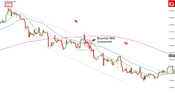
2. Identifying Corrective Areas
This is where patience is key. Markets never move in a straight, uninterrupted line. Even the strongest trends require rest and correction. These corrections are precisely the opportunities we wait for.
What Types of Corrections Should We Recognize?
- Pullback: The simplest form of correction. The price moves slightly against the main trend and then reverses. For example, in an uptrend, the price might show a few bearish candles before resuming its upward movement.
- Deeper Correction: Sometimes, the price retraces to significant support levels (like the 50 or 100-period Moving Average) and reacts from there.
- Complex Correction: In this scenario, instead of a simple move, the price forms a corrective pattern like a triangle or a flag.
How to Find Corrective Zones?
There are several simple tools for this:
- Tool 1: Fibonacci Retracement
After a strong move on the intermediate time frame, draw the Fibonacci retracement tool from the low to the high of the move (or vice-versa in a downtrend). The 0.382, 0.5, and 0.618 levels are often where the price completes its correction and reverses.
- Tool 2: Moving Averages
In an uptrend, the 20, 50, and 100-period Moving Averages often act as dynamic support levels. When the price reaches these averages and shows a reaction, it can signal the end of the correction.
- Tool 3: Short-Term Trend Lines
Sometimes, a correction forms as a small downtrend channel (within an overall uptrend). Drawing a trend line on this channel helps us identify where the correction might end.
Important Note: We are not looking to predict the exact bottom of a correction. We only want to identify zones where a price reversal is likely.
3. Defining Trading Ranges
On the intermediate time frame, clearer price patterns emerge compared to the higher time frame. These patterns tell us about the market’s behavior and its potential direction.
The Most Important Patterns to Recognize:
-
A) Channels:
-
Ascending Channel: The price moves between two parallel lines with a positive slope. Strategy: Buy at the lower channel line and sell at the upper channel line.
-
Descending Channel: The price moves between two parallel lines with a negative slope. Strategy: Sell at the upper channel line and buy at the lower channel line (if the main trend is bullish, buying from the lower line of a descending channel can be an excellent opportunity).
-
B) Flags and Triangles:
These patterns typically form after a strong move and indicate trend continuation.
-
Bullish Flag: After a sharp upward move, the price corrects within a small descending channel. A breakout above this channel signals trend continuation.
-
Bearish Flag: After a sharp downward move, the price corrects within a small ascending channel. A breakout below this channel signals bearish trend continuation.
-
Symmetrical Triangle: The price oscillates between two converging lines (one descending, one ascending). A breakout in either direction indicates the next move. In an uptrend, an upward breakout is usually more reliable.
-
C) Horizontal Support and Resistance Levels:
On the intermediate time frame, you can see clearer support and resistance levels than on the higher time frame. For example, you might identify a price zone that has reacted multiple times. These zones are very useful for setting stop-losses and price targets.
How to Put This Information Together?
Now that we’ve completed these three stages, we should have a clear trading scenario. Let’s proceed with an example:
Practical Example (Continuing from the previous one):
In the previous step (higher time frame), we identified that EUR/USD has an uptrend on the daily time frame and a strong support level.
Now, let’s move to the intermediate time frame (4-hour):
- Verify Alignment: On the 4-hour chart, we observe that the price has moved up from that daily support but is now in a corrective phase. This correction has not yet damaged the primary bullish structure. So, alignment exists.
- Identify Corrective Areas: The price made a strong upward move on the 4-hour chart and is now correcting. Using the Fibonacci tool, we mark the 0.5 level as a potential end zone for the correction. Simultaneously, the 50-period Moving Average is also located in the same area. This zone becomes very attractive to us.
- Define Trading Ranges: On the 4-hour chart, we see the correction is forming as a small bearish flag. The price is moving between two parallel descending lines. The upper line of the flag acts as resistance, and the lower line acts as support.
Our Trading Scenario: We will wait for the price to reach the 0.5 Fibonacci level and the 50-period Moving Average. If it shows a bullish reaction in that zone and then breaks the upper trend line of the flag, this will be a strong signal for trend continuation and our entry into the trade.
Common Mistakes in the Intermediate Time Frame
It’s easy to make mistakes when moving from the higher to the intermediate time frame. Here are a few to watch out for:
- Rushing to Enter: Some traders see a single opposing candle on the intermediate time frame and immediately assume the correction is over, entering the trade prematurely. It’s crucial to be patient and wait for more confirmation.
- Ignoring Higher Time Frame Levels: Always keep your higher time frame levels (support and resistance) visible on your intermediate time frame chart. Sometimes, a minor resistance level on the intermediate chart might perfectly align with a major level from the higher time frame, significantly increasing its importance.
- Focusing on a Single Pattern: Don’t just enter a trade because you see a flag or a triangle. Always consider the context: in what part of the trend did this pattern form, and does it align with your higher time frame analysis?
- Expecting Ideal Corrections: Sometimes, the market doesn’t undergo a deep correction and quickly resumes its main trend. If you wait too long for a specific type of correction, you might miss the trade altogether. It’s wise to consider multiple scenarios.
Entering on the Lower Time Frame
We’ve now reached the most sensitive and exciting part of the process. This is where we put all our previous analyses into action. If we’ve done our job correctly up to this point, we should have a clear picture of:
- Overall Trend: We know the main direction of the market from the higher time frame.
- Operation Zone: We know which area to look for an entry in from the intermediate time frame.
Now, it’s time for the lower time frame to act like a sniper, pinpointing the exact spot with the least risk and the highest probability of success.
Why Use a Lower Time Frame?
Imagine you want to board a train going from Station A to Station B.
- The higher time frame told you the train is heading North (an uptrend).
- The intermediate time frame told you the train is making a brief stop at a midway station (a corrective area).
- Now, the lower time frame tells you precisely when the train doors will open, allowing you to board. If you enter too early, the train might not have started moving yet, and you’ll be waiting. If you enter too late, the train will have already departed, and you’ll have missed it.
Choosing the Right Lower Time Frame
The lower time frame is typically chosen to be 1 to 4 levels below your intermediate time frame. For example:
- If your intermediate time frame is 4-hour, your lower time frame could be 15-minute or 30-minute.
- If your intermediate time frame is 1-hour, your lower time frame could be 5-minute or 15-minute.
- If your intermediate time frame is 30-minute, your lower time frame could be 3-minute or 5-minute.
Important Note: Avoid choosing an excessively low time frame. A 1-minute chart can be very noisy and confusing, unless you are an experienced scalper.
What to Look for on the Lower Time Frame?
1. Precise Price Patterns
On the lower time frame, price patterns form with greater detail. This is where you need to sharpen your eyes to spot reversal and continuation patterns
Important Patterns in an Uptrend (for Buying):
- Inverse Double Top (or Double Bottom in a Downtrend Correction): When the price is in a downtrend correction, it might form a pattern that, when inverted, looks like a double top (which in the correction context, is actually two valleys). A break of the neckline of this pattern to the upside is a buy signal.
- Inverse Head & Shoulders: One of the strongest reversal patterns. When it forms at the end of a downtrend correction and the price breaks the neckline to the upside, it’s a very strong buy signal.
- Double Bottom: When the price hits a certain level twice and reverses, then breaks through the middle level.
- Bull Flag: On the lower time frame, flags are often clearer. There’s a sharp upward move (the flagpole) followed by a minor downward correction within a small channel (the flag itself). A breakout above the channel is an entry signal.
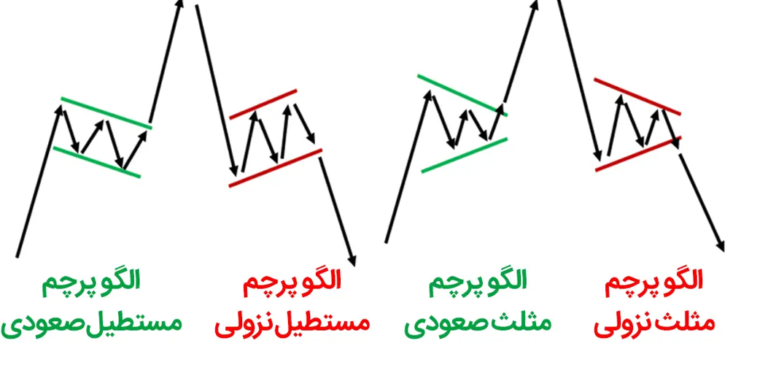
Important Patterns in a Downtrend (for Selling):
- Inverse Double Top (or Double Bottom in an Uptrend Correction): During an upward correction, two similar highs form. A break of the neckline downwards is a sell signal.
- Head & Shoulders: Forms at the end of an upward correction. A break of the neckline downwards is a strong sell signal.
- Double Top: When the price reaches a resistance level twice, fails to break through, and then breaks the middle level downwards.
- Bear Flag: A sharp downward move is followed by an upward correction within a small channel. A breakout below the channel is a sell signal.
Pro Tip: Always wait for the closing candle on the breakout side. A breakout with a strong, high-volume candle (if volume data is available) is much more reliable.
2. Breaking Minor Levels
Sometimes, complex patterns aren’t necessary. You just need to wait for the breakout of a simple level. These minor levels represent the last obstacles preventing the trend from continuing.
What Levels Should You Identify?
- Short-Term Downward Trend Line: In an uptrend, the correction often forms as a small downward trend line. When the price breaks this line upwards, it signals the end of the correction.
- Short-Term Upward Trend Line: In a downtrend, the correction often forms as a small upward trend line. A break of this line downwards is a sell signal.
- Previous Highs During Correction: Sometimes, during a downward correction, the price forms several small highs. Breaking the last of these highs can signal the start of an upward movement.
- Short-Term Moving Averages: The 20 and 50-period moving averages on lower time frames can also act as support and resistance. Breaking them with a strong candle can be valid.
Example: Suppose on the 4-hour (intermediate) time frame, we’ve determined that the price is correcting within a bearish flag. We switch to the 15-minute time frame. Here, we draw the downward trend line of the flag. The price has hit this line and bounced back several times. Now, we wait for a strong candle to close above this line. This is our entry point.
3. Reacting to Key Levels
This method is for those who prefer to enter trades at reversal points rather than breakout points.
How Does It Work?
We have a key level from the higher time frame (e.g., daily support). On the intermediate time frame, we’ve identified the correction zone. Now, on the lower time frame, we wait for the price to approach that key level and look for a reaction.
What Reactions Should We Look For?
- Reversal Candlestick Patterns:
- Pin Bar: A candle with a long wick on one side and a small body on the other. At support, the long wick should point downwards (indicating rejection of lower prices). At resistance, the long wick should point upwards.
- Engulfing Pattern: A large candle completely engulfs the previous smaller candle. In support, a large bullish candle engulfs the previous bearish candle. At resistance, a large bearish candle engulfs the previous bullish candle.
- Doji: A candle with a very small body, indicating indecision in the market. When it appears at a key level, it can signal a potential change in direction, but it’s best to wait for confirmation from the next candle.
- Fakeouts (False Breakouts): Sometimes, the price breaks a key level to trigger stop-losses, only to reverse quickly. If this happens and the reversal is strong, it can be an excellent signal.
Example: On the daily time frame, we have strong support at 1.1000. On the 4-hour time frame, the price is correcting towards this support. We switch to the 1-hour time frame. The price reaches 1.1005 and forms a pin bar with a long lower wick. This indicates that the market couldn’t push lower, and buyers have stepped in. This is an excellent entry point with a very low stop-loss (just below the wick of the pin bar).
Key Points for Successful Entry
1. Don’t Forget Risk Management:
- Precise entry allows you to place your stop-loss very close, which is the biggest advantage of this method.
- Stop-Loss Placement:
- For Buys: Slightly below the last low formed on the lower time frame.
- For Sells: Slightly above the last high formed on the lower time frame.
- If Using Patterns: Slightly below the pattern (for buys) or slightly above the pattern (for sells).
- Take-Profit Placement:
- First Target: The nearest resistance level on the higher time frame (for buys) or the nearest support level on the higher time frame (for sells).
- Next Targets: Subsequent levels or Fibonacci targets.
- You can also refer to the article on calculating trade volume.
2. Wait for Confirmation, But Not Too Long:
- A common mistake is waiting so long for more confirmations that you miss the trade.
- Good Rule: Enter after the breakout candle closes or the reversal pattern forms. Don’t wait for a second candle’s confirmation unless the pattern is very weak.
3. Pay Attention to Trading Volume (If Available):
- A breakout with high volume is much more reliable than one with low volume. In crypto and forex markets, volume can help you distinguish between a true breakout and a fakeout.
4. Have Multiple Scenarios:
- The market might behave differently than expected. Have alternative scenarios ready. For example, what will you do if the price reaches a key level, doesn’t react, and breaks through it? This prevents you from being caught off guard.
Common Mistakes on the Lower Time Frame
- Getting Lost in Noise: Lower time frames are full of small fluctuations. If you forget the bigger picture (higher time frame), you’ll get lost in this noise and trade emotionally.
- Premature Entry: A crucial rule: Don’t enter until the pattern is complete and the breakout has occurred. You might be tempted to enter early for a better price, but this increases your risk.
- Using a Stop-Loss That’s Too Tight: Don’t set your stop-loss so close that it gets triggered by the slightest market fluctuation. Pay attention to the market structure and leave some breathing room.
- Opening Multiple Trades Simultaneously: When you see several consecutive signals on the lower time frame, resist the temptation to take them all. Choose the best ones.
Full Practical Example (Continuing the Previous Example)
Let’s go back to the EUR/USD example:
-
Higher Time Frame (Daily): The trend is bullish. There is strong support around 1.0950.
-
Intermediate Time Frame (4-Hour): The price has moved up from the daily support but is now correcting. A bearish flag has formed, and the zone between 1.1020 and 1.1050 has been identified as the 0.5 Fibonacci retracement level and the 50-period moving average.
-
Lower Time Frame (15-Minute):
-
We go to the 15-minute chart.
-
Draw the downward trend line of the flag. The price has hit this line multiple times and bounced back.
-
A small triangle pattern is forming at the end of the flag.
-
We wait. The price reaches the 1.1030 area (coinciding with the Fibonacci level and the intermediate time frame moving average).
-
A pin bar with a long lower wick forms at this level.
-
A few candles later, the price breaks the downward trend line of the flag with a strong candle to the upside.
-
Action: At the close of the candle above the trend line, we issue a buy order.
-
Stop-Loss: Slightly below the pin bar and the low of the triangle, e.g., 1.1015.
-
First Take-Profit: Nearest resistance on the higher time frame, e.g., 1.1080.
-
Second Take-Profit: Previous high on the daily time frame, e.g., 1.1150.
Result: We aligned with the main (bullish) trend, waited patiently in a suitable correction zone, and entered the trade with a precise signal on the lower time frame, using a small stop-loss.
Final Summary
Entering on the lower time frame is an art that combines patience, precision, and analytical knowledge. This is where professional traders separate themselves from beginners. Professionals know that rushing at this stage can waste all previous efforts.
Remember:
- Always analyze from top to bottom.
- Find the direction on the higher time frame.
- Identify the zone on the intermediate time frame.
- Find the exact entry point on the lower time frame.
- And most importantly, always have a stop-loss and stick to it.
With practice and repetition, this process becomes a habit, and you’ll no longer enter any trade without looking at the bigger picture. This simple habit can significantly improve your trading performance.
Practical Example: EUR/USD Trade
Let’s imagine we want to trade the EUR/USD currency pair.
-
Higher Time Frame (Daily): On the daily chart, we observe that the price has been moving in an uptrend channel for several months. Recently, it has reacted to the support level at the bottom of the channel. Therefore, the overall trend is bullish, and our goal is to only look for buy opportunities.
-
Intermediate Time Frame (4-Hour): On the 4-hour chart, we see that after hitting the daily support, the price made an upward move but then entered a mild downward correction phase. This correction is forming as a flag or a small symmetrical triangle. The upper boundary of this flag acts as resistance; if broken, it signals a continuation of the uptrend.
-
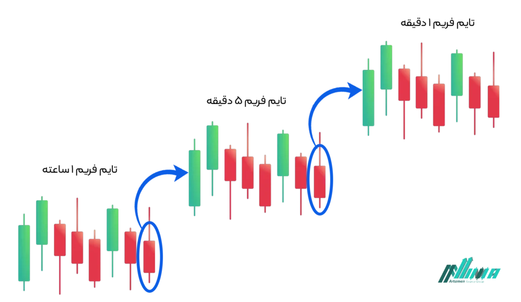
Lower Time Frame (15-Minute): Now, let’s move to the 15-minute chart. The price is fluctuating within this flag pattern. We wait for the price to decisively break the upper trend line of the flag (resistance) with a strong candle. Simultaneously, the RSI indicator might cross above the neutral zone. At the moment the breakout occurs and the candle closes above the trend line, we issue a buy order.
Result: With this method, we enter the trade in the direction of the strong daily trend, after the correction on the 4-hour time frame has ended, and with a precise entry signal on the 15-minute time frame. We can place our stop-loss slightly below the low of the flag or the last 15-minute downward swing, which is a short distance from our entry point.
Practical Example: Bitcoin (BTC/USDT) Trade
Now, let’s imagine we want to trade Bitcoin (BTC/USDT).
-
Higher Time Frame (Weekly): On the weekly chart, Bitcoin is in a long-term downtrend. It has recently hit a significant historical support level. However, there are no clear signs of a trend reversal yet, and the overall trend remains bearish. Therefore, we prefer to only look for sell opportunities.
-
Intermediate Time Frame (12-Hour): On the 12-hour chart, the price has moved up slightly from the weekly support but is now forming a bearish pattern, such as a descending flag, or a resistance zone. A short-term bearish trend line is also guiding the price downwards.
-
Lower Time Frame (1-Hour): We switch to the 1-hour chart. Here, the price has hit the bearish trend line multiple times and moved lower each time. We wait for the price to approach this bearish trend line once more. Then, on the 1-hour time frame, we look for reversal patterns like a “pin bar” or a “bearish engulfing pattern” near the trend line. If such a pattern forms, we can issue a sell order.
Result: Our entry is in the direction of the weekly downtrend, after reacting to resistance on the 12-hour time frame, and confirmed by a precise reversal pattern on the 1-hour time frame. We place our stop-loss above the high of the reversal pattern or above the bearish trend line.
Conclusion
Multi-time frame analysis is an essential skill for any trader looking to improve entry accuracy and reduce losses. By following these three fundamental steps, you can make this method a part of your trading routine:
- Higher Time Frame (Roadmap): Identify the main trend and key levels.
- Intermediate Time Frame (Execution Zone): Find the market structure and correction or continuation areas.
- Lower Time Frame (Trigger Point): Identify the best entry point using precise price patterns and small level breakouts.
Remember that no analysis is 100% accurate, but using this approach significantly increases your chances of success. Always remember risk management and define your stop-loss before entering a trade.
Similar articles you need to read:
What is a Miner Device? Full Comprehensive Review of Cryptocurrency Mining Miners
Which Bitcoin Mining Software Offers the Highest Returns
Cloud Mining of Digital Currency; Introduction to Cloud Mining Sites
Introduction to 8 Gold-Backed Cryptocurrencies
The Impact of Gold Production in Chinese Laboratories on the Future of the Global Gold Market